Wonder ABA is a Texas based ABA center committed to providing world class ABA care to children and their families.
The Ask
Wonder ABA was founded as a new ABA therapy center in Texas, created to support children with autism and their families. My client needed a brand identity that felt warm, welcoming, and trustworthy.
Because ABA therapy is centered around growth, progress, and individualized support, the logo needed to evoke hope and forward movement while still feeling playful and child-centered. The goal was to create a visual identity that communicated compassion, optimism, and the joy of small but meaningful milestones.


The Logo
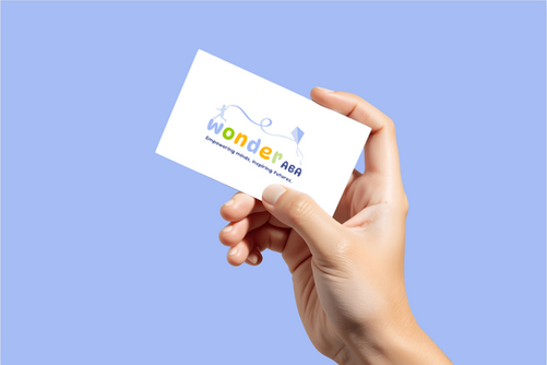
The final logo embodies hope and forward movement through thoughtful color, approachable typography, and meaningful symbolism. A playful yet polished font keeps the brand inviting, while the child flying a kite represents carving one’s own path and rising toward success. The upward motion and vibrant palette reinforce positivity, growth, and the spirit of possibility.
Brand Identity
To ensure long-term consistency, I developed a cohesive brand identity system delivered through a comprehensive brand book. This guide outlines logo usage, color palette, typography, and visual standards, providing Wonder ABA with a clear and scalable foundation that reflects its mission while building trust and recognition across every touchpoint.


